
Sentaurus Visual
3. Working With XY Plots
3.1 Introduction
3.2 Creating an XY Plot
3.3 Adjusting Curve Properties
3.4 Modifying Plot Appearance
Objectives
- To introduce the basic controls of visualizing xy plots in Sentaurus Visual.
3.1 Introduction
Sentaurus Visual can create xy plots, also referred to as 1D plots. Such plots are commonly produced to visualize data stored in PLT files produced by Sentaurus Device. The xy plotting functionality of Sentaurus Visual essentially duplicates the functionality of Inspect.
This section demonstrates how to create Id–Vg curves using the graphical user interface (GUI) of Sentaurus Visual and how to customize plot appearance.
The files discussed in this section are part of the Sentaurus Workbench project export. The complete project can be investigated from within Sentaurus Workbench in the directory Applications_Library/GettingStarted/svisual/export.
3.2 Creating an XY Plot
To follow this section, load the files idvg1_des.plt and idvg2_des.plt from the Sentaurus Workbench project Applications_Library/GettingStarted/svisual/export into Sentaurus Visual.
The GUI to load data and to create curves on xy plots was designed to mimic the interface of Inspect and should look familiar to TCAD Sentaurus users. Therefore, this section gives extra attention to the differences in the Sentaurus Visual GUI and functionality.
Loading an xy file does not automatically plot the dataset associated with it. Instead, the loaded datasets appear in the Selection panel, and a blank plot is created. To plot Id–Vg curves:
- Select the loaded dataset. To select multiple datasets, hold the Ctrl key and click the required datasets.
- To assign Vg to the x-axis, select gate in the middle pane and then InnerVoltage in the bottom pane, and click the To X-Axis button. Figure 1 shows the Selection panel at this stage.
- To assign Id data to the y-axis, select drain in the middle pane and then TotalCurrent in the bottom pane, and click the To Left Y-Axis button.
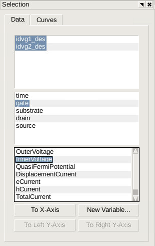
Figure 1. Selection panel showing active 1D datasets and interface to create xy plots.
Id–Vg curves are generated according to this selection. At this time, the plot appearance, such as legend font size and tick number formatting, reflects user preferences. Subsequent sections will show how to customize the plot appearance. To make future plots appear in a particular format, you need to customize the user preferences for xy plots.
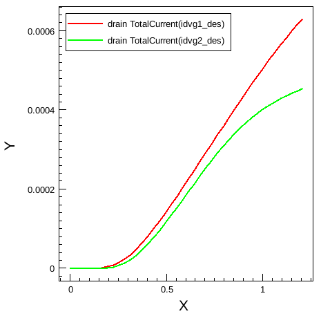
Figure 2. Drain current versus gate voltage curves plotted in Sentaurus Visual for two datasets. The plot appearance has not been customized and reflects user preferences.
3.3 Adjusting Curve Properties
To adjust the curve appearance on the plot, the curve must be selected first.
To select a curve, either click the curve itself with the
![]() Select tool, or select the curve from the Curves tab of the
Selection panel.
Select tool, or select the curve from the Curves tab of the
Selection panel.
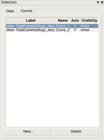
Figure 3. Curves tab of Selection panel showing 1D curves.
If two curves are close to each other, accurately picking one curve using the
![]() Select tool can be challenging. To facilitate selection of curves that are in
close proximity, Sentaurus Visual can change between two neighboring curves when
selecting a point.
Select tool can be challenging. To facilitate selection of curves that are in
close proximity, Sentaurus Visual can change between two neighboring curves when
selecting a point.
To change the curve properties, click the Curve Properties tab at the bottom of the Selection panel. Figure 4 shows the Main tab of the Curve Properties panel.
To change line type and color, to include markers on the curve, and to edit marker shape and size, click the Shape tab. The Trans. tab allows you to perform quick manipulations on the curve to plot an inverse of the curve, or to apply simple transformation functions, such as abs() and exp().
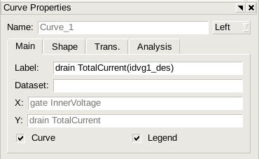
Figure 4. Curve Properties panel.
From the Curve Properties panel, Sentaurus Visual can only modify properties of one curve at a time. To customize the properties of multiple curves at the same time, open the Curve Properties dialog box by choosing Data > Curve Properties, or pressing Ctrl+Shift+E.
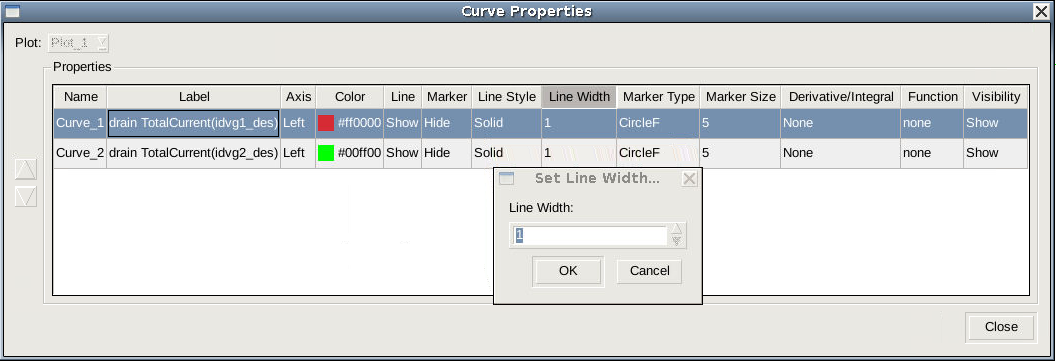
Figure 5. Curve Properties dialog box for changing the properties of multiple curves. (Click image for full-size view.)
To select multiple curves, hold the Ctrl key and click the required curves. Click the column header of the property to change and apply your change.
You can use the Up arrow button and the Down arrow button at the left side of the dialog box to change the order of the curves.
3.4 Modifying Plot Appearance
To control the axis range, number formatting, font selection, font size, and so on, click the axis to open the Axis Properties panel.
Depending on the window resolution and some other Sentaurus Visual settings, the Axis Properties panel might open another panel and you will need to move the Axis Properties panel to the front manually by clicking it.
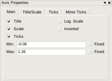
Figure 6. Axis Properties panel.
To edit the axis title, click the Title/Scale tab. To include Greek symbols in the title, use the following XML tag: <greek>character</greek>.
To format text as a subscript, use the following XML tag: <sub>character</sub>. To format text as a superscript, use the following XML tag: <sup>character</sup>.
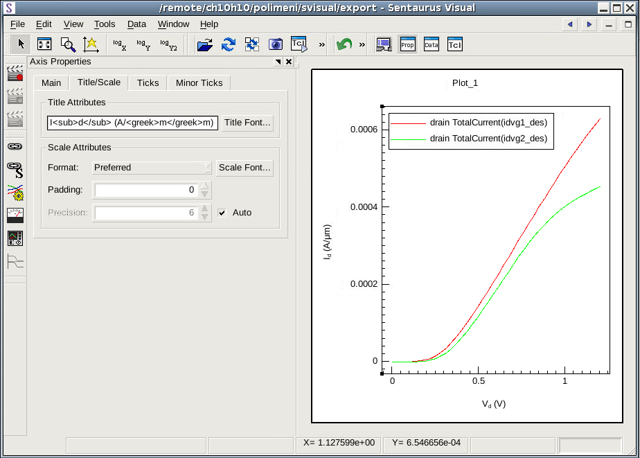
Figure 7. Editing axis title in Axis Properties panel. (Click image for full-size view.)
Unicode character support is available only for xy plots. You can use special characters in the plot title, axis titles, and legend of xy plots.
Both 2D and 3D plots do not support unicode characters.
To modify the legend appearance, click a legend. Similarly, to edit general plot properties, click anywhere on the plot. The Plot Properties panel allows you to modify plot scaling, the grid, and colors.
Copyright © 2017 Synopsys, Inc. All rights reserved.